Tuesday 19 November 2013

Part two - Reflection

Development of Technical and Visual Skills
I think that my technique has improved a lot in this section. I have found that I am drawing quite a lot quicker and with less hesitation. I think that I am much better with certain materials now; I am a lot more confident with the markers and oil pastels, which I had not used before. I think my compositions are fairly bland sometimes though, and I need to experiment with having some objects being cut off the page.

Quality of Outcome
I am pleased with all of my work in this section apart from the sketches of animals. I found that really difficult and thought the drawings for that section were quite poor. There were maybe 2 drawings in the whole of that exercise that I thought were decent.
I thought that the drawings in marker pens were quite good, both the fish and the flowers, I was very pleased with those. I also liked the graininess of the oil pastel pictures.

Demonstration of Creativity
I tried to experiment with mixing media - e.g. I mixed oil pastels with coloured pencils, and markers with coloured pencils. I think those experiments were mostly successful, but I was quite worried about the markers because some of them have ended up a bit dirty.

Context
I had to do the first two check & log and research points together because I somehow missed the first one. I am quite bad at remembering to add things to my learning log, but I think that I managed to make quite good notes in this section of the course.

Part two - Learning Log - Check & Log

Check & Log 1 (Exploring Coloured Media)

Which of the media you have experimented with did you find most expressive? Make notes in your learning log on the pros and cons of each medium.
  • I think the different mediums are expressive in different ways. The oil pastels are very expressive because of their vivid colours, and using them I think you would be able to create a beautiful drawing, though i think the colours would not be true to life. I think marks would be expressive in a similar way, however I think the colours may be slightly more true to life, and the blending is more subtle than with oil pastels. Coloured pencil can produce more accurate colours but the thinner lines and less vibrant colours to me are less interesting than the other mediums.
Which medium do you think lends itself to very detailed work?
  • Before seeing Henri Fantin-Latour's work I thought that mediums with small tips, e.g. pencils, biros, fineliners, would be more effective in detailed work. Now I think you can use any medium and achieve a detailed work, but a that a variety of stroke widths give a much better effect.


Check & Log 2 (Detailed Observation)

Which drawing media did you find most effective to use, for which effects?
  • The fineliners are fun for line drawings, they give a nice bold line and can give some fine details. It is tricky to use them for shading but I did not attempt this as I used them only on the line drawings. I found the markers and dip pens useful on the stipples and dots exercise as they gave different widths of stipples/dots, which allowed for variation and detail. The pencils i used for Getting tone and depth in detail were very versatile as they were able to depict light and dark tones, and a sharp point allows precise marks and a blunter point gives wider marks. I think the pencil was most effective here, but I have not used markers very much before so I think I will find them more effective as I use them more.
What sort of marks work well to create tone, pattern and texture?
  • I think dots and hatching is useful to create tone, pattern and texture. But more 'random' marks and a lack of pattern can give a nice scruffy texture.
Did you enjoy capturing details or are you more at home creating big broad brush sketches?
  • I did enjoy capturing details, however I have not really done any work with big broad strokes before. I found the stipples and dots interesting to do, but I think i should've used some colour to indicate the form more accurately. I like to be accurate but I found the Getting tone and depth in detail exercise quite difficult because I had to stare at the object so much, and no matter how much I drew there was always something to add. That is why I really liked doing the line drawing of the mushroom, the lines give the impression, and despite there only being a few lines, the object still appeared! I think that the more details you add, the more details you still need to add, but if you do not aim for detail you can achieve a result that is just as interesting with only a small amount of detail. I think adding too much detail somehow makes the drawing lose something.
Look at the composition of the drawings you have done in this project.
  • I seem to keep placing my objects too much in the middle of the page. I always end up with space on all sides, so I think I should try to use some compositions where objects are cut off at the edges.


Check & Log 3 (Still Life)

What aspects of each drawing have been successful, and what did you have problems with?
  • I think my choice of objects for the Still life group in line exercise was poor. I should have gone for objects with more interesting shapes individually. I think the result is that I have a drawing with too many spindly objects, and not enough objects with substance. For example I should've had some bigger round objects in there, maybe some bigger flowers. For Still Life Group in Tone I liked the selection of objects, but I am not happy with how I used the oil pastels on the leaves. I tried to add detail with coloured pencil but I do not like the result of the leaves. However I really like how the mushrooms turned out with just a small amount of oil pastel.
Did you manage to get a sense of depth in your drawings? What elements of the drawings and still life groupings helped to create that sense?
  • I think that I managed to achieve some depth in the Still Life Group in Line exercise, however as I siad above, I think I would have achieved a better composition and suggestion of depth if I had some other objects of a more varied size. I think there is a three dimensional look but only a slight one, although that may just be because it is only in line. I think the thicker lines suggest form quite well. In the Still Life Group In Tone exercise I think the leaves look too flat, but the shape of the mushrooms is good.
What difficulties were created by being restricted to line or tone?
  • It is harder to suggest depth with only line,as the only way is to vary the line thickness. I think that using tone only does not have as many limitations, as by using tone you get the effect of a line almost automatically.


Check & Log 4 (Drawing Fruit and Vegetables in Colour)

Your composition should occupy most of the paper's surface. How much negative space do you have left?
  • I always seem to have negative space left in the same place - around the edges of the drawing. I noted earlier in the project that I should try to position objects coming off the page slightly, but I seem to be drawn to the centre of the page.
What have you learned from drawing the details of fruit and vegetables?
  • I have learned how to present form, and how to position objects interestingly (except for the point above). I think that what I have learned by drawing these objects can be applied to everything else, as all objects can be made up of regular objects, such as spheres and cubes, and many of the natural objects are almost regular in shape.
What did you find most challenging about this part of the course?
  • I have struggled with how to use the oil pastel. I really like the grainy effect when using oil pastel on grainy paper, but I am not sure if that is ideal or not. I think smooth paper will be too slippery for oil pastel, and will not give such an interesting result. I also struggled a bit with blending the markers, as I am not entirely sure how to use the 'Colourless Blender' in my marker set without making it dirty (and dangerous for the next time it is used!).


Check & Log 5 (Drawing Plants and Flowers)

How will your experiments with negative space help your observational drawing in the future?
  • The negative space experiments have really highlighted how important it is not just to look at an object, but the relationship between an object and other objects around it. I think in future this will help me with compositions, making the spacing of objects accurate, and help with the proportions of certain parts of objects.
What techniques did you use to ensure you drew your plants in proportion?
  • I compare different parts of the plants to each other to see roughly how much space they should take on a page. I also look at the distances between objects.
How did you achieve an effect of three-dimensional space in your drawings?
  • The composition of the objects helps - having objects in front of one another and depicting the shadows cast from one object to another. Also having objects that don't have a lot of flat surfaces - e.g. the leaves of a plant are quite flat, but the flowers of roses are quite rounded in parts, and the flowers of lilies flare outwards quite a lot.


Check & Log 6 (Drawing Animals)

What were the main challenges of drawing animals?
  • My main challenge was finding one that would sit still long enough for me to draw more than two lines. I attempted to draw my dogs in different poses but they were quite alarmed when I was staring at them for more than 5 seconds. It helped me to try to draw a shape quickly though, and I think I improved after the first few attempts.
Which media did you enjoy using most and which did you feel were best for the subject matter and why?
  • I found the charcoal most useful as it was very expressive and I could do a few quick strokes and still get the impression I wanted. Especially as I could then blend the charcoal rather than attempting to get more lines in. I also found the markers quite useful as I could block in colours for highlights and shadows rather than trying to draw a pose with lines.
Where can you go to draw more animals? Think about the sorts of places that will give you opportunities for animal drawing. Have you tried drawing a moving animal yet?
  • My first thought would be a zoo or a wildlife centre. There are also a lot of rabbits or hares at a marina near where I live, so if it was not too busy I may be able to attempt to draw those in the future. I have not tried to draw a moving animal (at least not on purpose).

    Part two - Learning Log - Research Points

    Research Point 1 (Masters of Detail)

    Charles Mahoney 1903-1968


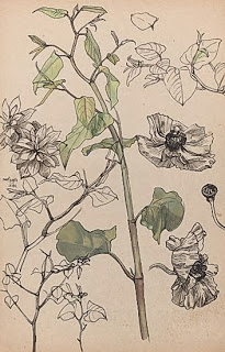
    Polygonum and Anenome de Caen, 20th century
    Image from http://www.lissfineart.com/picture/96

    I chose this piece as it contains a flower that I also used as a subject in my line drawing of a still life group a bit later in this section of the course. In my line drawing I used hardly any lines to show the detail of the petals, as I wanted them to look soft. However, Mahoney used a lot of lines to show the creases and crumples and still managed to get a soft effect. His use of line is quite extraordinary as it is very precise, and where he only uses a few lines he manages to suggest the form exactly. He uses both curved and straight lines when drawing branches and stems, giving them a very realistic feel. His use of tone and colour is quite simple but is highly effective, as the shadows, curves and markings on the leaves are extremely accurate.


    Henri Fantin-Latour 1836-1904


    White Roses, Chrysanthemums in a Vase, Peaches and Grapes on a Table with a White Tablecloth, 1867
    Image from http://tinyurl.com/olxs5d9

    In this work, there is a kind of grainy effect, however it does not obscure the details of the objects in the still life. The use of tone makes it so that you can see every single petal and leaf of the roses and chrysanthemums. Even though the grapes are nearly black, you can see the edge of each one, and the small highlights really give them a three dimensional look. The slight fold in the corner of the tablecloth is very subtley presented. Every object has seems to have so much detail. I always think that detail is achieved using small marks, but if you look closely you can see that some of the marks used are actually quite big.


    Research Point 2 (Artists with Contrasting Styles)

    Zeana Romanovna

    (Please click link to view image)

    I found this artist by mistake when looking for an artist with an expressive style and really loved this painting. Like in John Ruskin's Study of a Sprig of a Myrtle Tree, the edges are not exactly defined, and there is an almost blurry look to the picture. However the use of colours is much different. The colours here are a bit psychadelic and probably nothing like they were on the object being painted, but the shape and beauty of the flowers is presented really beautifully. There is enough detail to show the stems and petals, but the brush strokes are very big and almost messy. The style is very relaxed and fun, but the placement of the strokes and the colours used suggest the form and tone accurately.

    Henri Biva


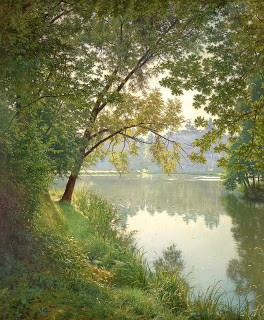
    Matin à Villeneuve (From Waters Edge), 1905-06
    Image from http://tinyurl.com/ltdv8jb

    The colours in this piece are much more natural and realistic. The strokes are much smaller, which allows for finer details to be defined. The piece is less fun, but more realistic. There is a great deal of detail, for example the blades of grass are defined individually, and the leaves of the bushes and the trees, and even the spaces between the leaves are defined to show the sky behind. The objects in the foreground are not the only things that are drawn precisely, as you can see that on the reflection of the background on the water, the form of the trees is presented accurately, and even the slight ripples of the water are present. The highlights and shadows on the leaves and on the bark of the tree are very realistic.


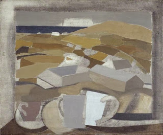
    Research Point 3 (Ben Nicholson)

    Why does he simplify still life forms and negative space and superimpose them on the Cornish landscape?

    Nicholson's art allowed him to 'explore his interest in uniting objects in the foreground with those in the background' (richardgreen.com). You can tell that Nicholson was really inspired by the landscape as it is present in all of his work.


    My favourite work of Ben Nicholson is Window in Cornwall (1946). I like it because it is between the stage where he drew landscapes and still life separately, and the stage where he superimposed the still life objects onto the landscape. It also reminds me of family holidays to Cornwall and looking out at the sea.


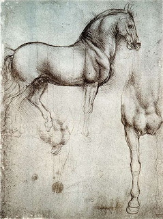
    Research Point 4 (Depictions of Animals by Renaissance Masters)

    Leonardo Da Vinci


    Da Vinci's animal drawings focus on the shape, structure and pose of the animal, with little detail on the actual creature other than base shadow. In the drawings I have seen, Da Vinci has not drawn long haired or very texture animals, so it looks as though he does not depict fur or texture on the animal, but focuses more on the shape and proportions. This might be the case only on the two drawings I have selected though (a short haired dog and a horse), as the texture of the horses mane is very realistic.
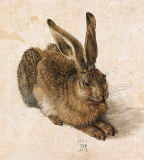
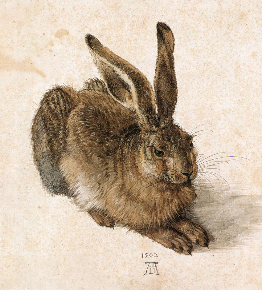
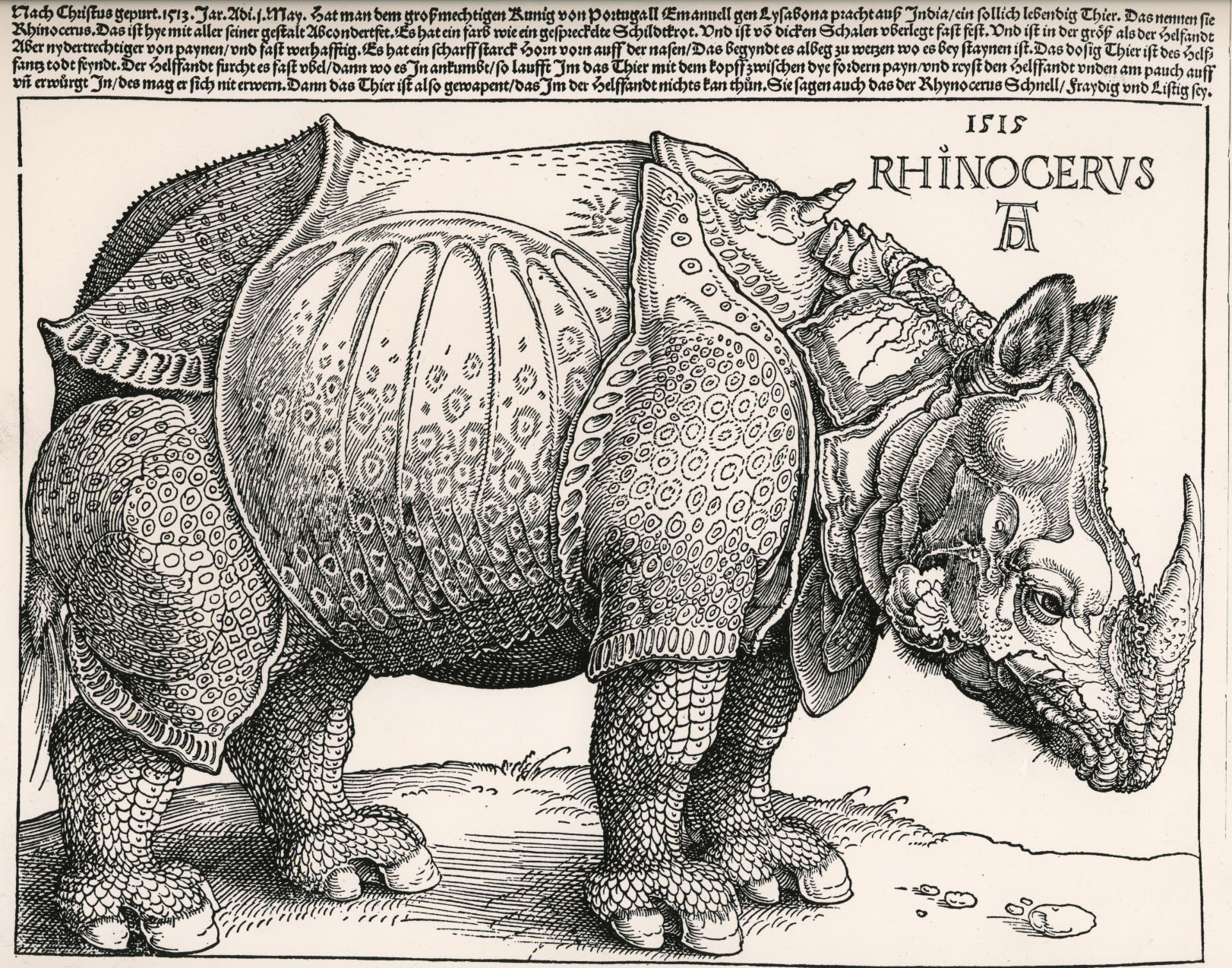
    Albrecht Durer

    You can see in Durer's Rhinoceros and Young Hare that he takes into account the texture of the animal.


    The fur of the hare is very realistic, it looks fluffy and has a sheen to it. The eyes are also very realistic and have a glossy look to them. The poses he has the animals in are very interesting, and the structure is accurate even with the, on the hare, fur details on top you can see where the legs are bent and where the skin folds.


    The rhinoceros' skin looks armoured, almost like plate mail, and has a circular pattern over it. The texture of the horn is clearly rough.


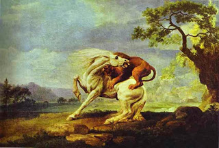
    Research Point 5 (George Stubbs)

    George Stubbs (1724-1806)

    By studying the anatomy of horses, cats and dogs, Stubbs was able to understand the different poses and motions the skeleton and muscles of the animal is capable of making, with anatomically correct pivoting and joint movement. 

    Study by George Stubbs of a horse's skeleton

    Study by George Stubbs of a horse's skeleton with some muscle

    This helped him draw horses accurately in a variety of dynamic poses - galloping, walking, and standing. Durer and Da Vinci both drew motionless animals. The benefit of the skeletal drawings is clear when looking at Stubbs' pictures of horses with lions, as the horses are in unusual positions but they are drawn perfectly - as if the horses posed for the drawings in those positions. The way he has drawn the muscles is incredible.


    When you compare his drawings of the lions to those of the horses, you can see that he has a better understanding of the figures of horses. The horses are always confidently presented as the main figure in the drawing, basked in light, whereas the figure of the lion will be obscured by shadow or partially hidden behind the horse. It looks as though he probably used his studies of cats to draw the lions, as I don't think he would've had any access to lions. The bone and muscle structure of cats is very similar to lions, and they have a similar stance. The lions look quite small - probably to show how majestic the horse is.


    Thursday 25 July 2013

    Part one - Reflection on Assessment Criteria

    Reflection on Assessment Criteria

    I definitely need to get more organised - I'm very sorry for the many delays with this Project.

    • Demonstration of Technical and Visual Skills materials, techniques, observational skills, visual awareness, design and compositional skills
    I think I definitely need a lot more practice with charcoal, pastels and the dip pen. I think I am okay with pencil and pens, and techniques such as hatching and crosshatching. I struggled in the texture project, but managed to convey the texture quite well in the assignment, so I hope I'm getting better at that!

    I think my observational skills are okay, I find the reflected light and shadow drawings interesting and not too confusing on the whole, but when the light merges too much I find it quite difficult to tell where it is coming from.

    I think my compositions have been quite ok in the projects so far... I think the layout I choose is good generally but I am not very good at making the arrangement of objects fill the page enough. There was quite a lot of blank paper in the second drawing of my assignment so I should've drawn the objects a bit bigger to fill more space.

    • Quality of Outcome content, application of knowledge, presentation of work in a coherent manner, discernment, conceptualisation of thoughts, communication of ideas
    I think the quality of my drawings has been quite varied. I think my drawings for the texture project were not very good, but I was very pleased with the finished product in the assignment and in the still life project.

    I am not very good at planning, I'm not sure if this is due to time restrictions though - I think I need to do more preliminary sketches for most of the projects, but when I managed to find time for the exercises I always ended up rushing a bit too much.

    • Demonstration of Creativity imagination, experimentation, invention, development of a personal voice
    I have never been good at experimenting with materials and tools but I think that this first part of the course has really helped me with that. I still need a lot of practice with the things that are new to me but I am finding the exercises very useful and mostly using the tools and materials correctly although not very successfully sometimes.

    • Context reflection, research, critical thinking (learning log)
    I think I ramble too much in my log and notes, but I am finding the reflection helpful. I'm not always exactly sure what to research about an artist in the research points, but I find the research useful anyway, so hopefully I'm not doing it wrong! I think I have identified my main weaknesses and I am sure the feedback from this part will help me improve a lot.


    Part one - Assignment One

    Assignment One


    Preliminary Sketches


    First drawing


    Second drawing

    This is what I decided to draw for my man-made objects drawing:


    The sneakers are the same material as black jeans, so have a slightly rough texture. The shoes are red patent and are quite reflective. I liked the combination of textures and colours in this arrangement.

    This is the initial sketch. I was pleased with how this turned out so decided to continue with this as my final drawing.


    And here is the final drawing:


    The texture, tone and reflected light turned out much better than I expected, so I am very pleased with this drawing. I was worried that I wouldn't be able to get the shoes to look shiny enough, or get the fabric to look the right texture on the sneakers, so I am happy with the result.
    The only thing I'm not sure about is if the black sneaker is slightly too small. It is actually a smaller size than the red shoe anyway (shoe is 1 size bigger), but I'm not sure if the sneaker being smaller makes the drawing looks a bit like two separate drawings on the same piece of paper, rather than two objects in the same composition.

    Reflection on assignment


    • Did you do enough preliminary work before starting work on your final pieces?
    I think I could have done more rough preliminary sketches to test out different compositions, however I was and still am happy with the compositions I chose. I think I should've done more experimenting with ink before I decided on that as my medium for the first drawing.
    • Do your large drawings give an accurate interpretation of the still life groups? If not, what went wrong?
    Yes, however neither of them have a background, and I wonder if on one of them at least I should have done a background rather than only the cast shadows.
    • Did you make a good selection of objects or did you try to include too much? Would you change the arrangements of objects if you were to start again?
    I think my selection and arrangement of objects for the first drawing was good and I wouldn't change this arrangement at all. In the second drawing I keep thinking I should've had one more object in the arrangement, but I am happy with the position of the two objects in relation to each other, so I would've had those arranged the same even with a third object.
    • Do your drawings fit well on the paper or could they be improved by working on a larger sheet of paper?
    I feel that with both drawings I should've made the objects fill more of the page, I think using a larger sheet of paper would've made that problem worse!
    • Did you have problems with drawing or find hatching too difficult?
    I think both drawings went well without any real problems. The only problem was with the first drawing, as I accidentally smudged the ink a few times, and I used too much ink in a few places and then was stuck with certain areas too dark. I had to change the tone in other parts of the picture to suit the overly darkened bits. 

    Part one - Enlarging an image

    Project: Enlarging an image


    Exercise - Enlarging an existing image


    Exercise - Enlarging a simple flat image


    Check and log

    • How successful were you in copying the lines from the smaller squares to the larger squares?
     The first drawing was more successful than the second, but I think the exercise was successful overall!
    • Are you satisfied with your larger replica of the image? What would you do differently another time?
    I would measure the grid lines more precisely as I think they were slightly out in both pictures.

    Part one - Using texture

    Project: Using texture


    Exercise - Experimenting with texture


    Exercise - A drawing with textures

    Drawing 1 - Rocks and seaweed

    Reference

    Preliminary sketches

    Finished drawing

    Drawing 2 - Rocks

    Reference

    Finished drawing


    Check and log

    • Have you discovered any new ways of using your drawing tools to depict surface and texture?
    I used the techniques from the first project to experiment. I found using the pencil almost flat very useful for making texture. It was also interesting to see how the sharpness of the pencil helped with texture, as a worn tip was much more grainy than a sharpened tip.
    • How successful were you at implying form with little or no tonal hatching?
    I found that it was much harder to imply form without using any hatching at all, but a small amount of hatching was still able to show form quite effectively.
    • What are your impressions of frottage as a drawing technique?

    I thought the effects were very cool and would be interesting for backgrounds or larger pieces. I'm not sure if I would use it to make a small texture drawing because the effects are not very reliable on small areas.


    Part one - Still life

    Project: Still life


    Exercise - Still life sketches of made objects


    I accidentally cut off the notes when I took the photos, next to the pencil drawing it says:

    "There was much more reflected light with these items than i was expecting. The cast shadows should have been drawn with either diagonal or horizontal lines. I don't like the effect of the vertical lines. The glass looks too messy."


    The notes next to the pen drawing were accidentally cut off as well, they are:

    "I think this turned out a lot better than the pencil drawing above, and I prefer the arrangement here. I really like the pen marks, they somehow show the curvature more effectively than in my pencil drawing. The glass looks more accurate and transparent with fewer lines."

    I really like how the pen drawing turned out, it is one of my favourite pieces so far in the course.

    The more I look at it the more I think the glass in the pencil drawing looks very messy, I will remember to use less lines next time.


    Exercise - Composition of natural objects


    I really enjoyed drawing the fruit, and I think this time the pencil suited the subject better than the ink. The pencil works well for natural objects and I wonder if the ink was a bit harsh for the subject here. I think fewer marks with the ink would have worked better for these objects.


    Check and log

    • Do you think it is easier to suggest three dimensions on man-made or natural objects? Try to explain your answer.
    I think usually man-made objects are easier because they tend to be more regular. Fruit and vegetables on the other hand often have knobbly bits, dents and are less e.g. spherical (in the case of round fruit!) than say a tennis ball.
    • How did you create a sense of solidity in your composition?
    I tried to keep the objects together but not quite touching, so they were not crowded but not too far apart either. The contract in tone and cast shadows helped the composition work.
    • Do you think changing the arrangement of your composition makes a difference to your approach and the way you create a sense of form?
    I think the approach is the same. The contract between the objects and the lighting create the form. However it would be harder to create a nice composition if all the objects were of the same colour/tone and in the same lighting conditions. A bunch of grapes in full shade would be quite a difficult arrangement to draw because all the parts would be uniformly dark and would probably end up looking quite flat.
    • How did you decide how to position yourself in relation to the objects?

    I placed the objects on the window sill as the lighting was pleasant... I was then quite restricted as to where I could sit but chose the angle that I thought looked most complimentary to the fruit!


    Exercise - Observing negative space and perspective


    Part one - Reflected light

    Project: Reflected light


    Exercise - Study of light reflected from one object to another


    Exercise - Shadows and reflected light and shade


    Research point - Patrick Caulfield

    Patrick Caulfield's work is in some ways quite simple, many of his pictures use only a few colours, and the shapes of the objects are simplified, as in his White Ware prints. His use of negative space is very interesting, as it makes the detail of the picture the background, rather than the subject. The subject still remains the focus in some ways, as it is much bolder due to the lack of details. However it is sometimes hard to see what the main subject is. In 'Reserved Table' you would expect the table to be the subject, however the focus is the lobster in the background, because the colours pop out.

    I really like his later works, such as 'After Lunch'. In this, Patrick Caulfield's style contrasts simplified objects with one very realistic object.

    For my drawing in the style of Patrick Caulfield I have used negative space in an otherwise quite realistic picture. I think now that I should have used a less realistic, more cartoon-like approach on the bricks of the fireplace, to make it more like Patrick Caulfield's work. I am not overly happy with the results this time, but hope to experiment with negative space more in the future.


    Check and log

    • What are the difficulties in separating cast shadow from reflected light and shade?
    The difficulty depends a lot on how complex the shapes of the objects are. if the shapes are regular it is easier to see and predict where the shadows will fall and where the reflections will be. If there are a lot of grooves or different curves then it gets trickier. Cast shadows are easier to see and depict, as they have a more obvious direction and cause, but reflective surfaces can show reflections that you wouldn't expect.
    • The reflected shadow and light follows the contours of the objects. How have you shown this in your drawing?
    On the metal tin you can see that there is an almost straight white line on the side facing the jug/tankard type object. The white line moves with the grooves in the tin. The same happens on the jug, as the white line follows the curve of the object, and where there are shadows there are darker sections.

    Part one - Tone and Form

    Project: Tone and form


    Exercise - Observing shadow and light formations on a surface


    Exercise - Tonal studies


    Experiment - Robinia


    Research point - Odilon Redon

    The work of Odilon Redon is new to me - I had never heard of him before this project.

    When I first started researching, I was introduced with very colourful, beautiful pictures, with atmospheric lighting and angelic looking figures. These were apparently his later works.

    I was a bit shocked when I saw his earlier works, as they are completely the opposite. Odilon Redon has been called 'Prince of Dreams', but his earlier works look like they are based on his nightmares. They are very dark, and rather than being bright and dramatic, are actually very disturbing. They are devoid of any colour and look as though they are by a completely different artist.

    The contrast between the dark, grim faces in his earlier works and the bright, flowery, and beautiful colours in his later works is extreme. The earlier works look like the work of a very depressed person, who seems to have a strange obsession with spiders and menacing eyes that stare straight at you. In the later works most figures are looking to the side, and the whole piece is peaceful and vibrant.


    Lane of Trees
    (From here)

    Bouquet of Wild Flowers

    (From here)

    Check and log

    • How difficult did you find it to distinguish between light from the primary light source and secondary reflected light?
    In these exercises I didn't find much reflected light, however in the exercises in the next section I found the different light sources quite confusing. I occasionally moved the objects slightly to check where the light was coming from. On some objects it was more obvious where the light was coming from, for example objects with very smooth, flat or rounded surfaces. Surfaces with nooks and grooves distorted the light a lot so it was not obvious what the source was.
    • How has awareness of light and shade affected your depiction of form?
    Light and shade have given the drawings a much more three dimensional look. The objects look much less flat and transparent, and have a lot more depth and texture.